Sign Talk

Get industry leading information and powerful tips.

Signage is Marketing

Tell your brands story through custom signage.

Wednesday, August 8, 2018


Successful Restaurant | Signage

Many entrepreneurs opened restaurants in 2017. From the fall of 2016 to the fall of 2017 over 26,000 new restaurants were opened by well intentioned owners.* Of the 647,288 open restaurants in the fall of 2017, 190,649 or 29% are quick service restaurant franchises and 31,480 or just 5% are full service restaurant franchises. That means that 66% of the restaurants open in 2017 were independent full service restaurants. If you’re a part of this 66% you understand the veracity of the competition in the food industry. It’s not just the food that brings people to your establishment, it's the whole experience. If you plan to open a restaurant in 2018 you have your work cut out for you and we're here to help.
Opening a new restaurant can be a daunting task. One thing you can not forget is your marketing. Once you’ve taken care of your business plan, funding and creating your menu you can turn your attention to the marketing aspect of opening your new business. Designing the look and ambiance of the space is one of the most important tasks. A huge part of this is your signage.

Signage for your establishment runs the gamut from bathroom wall plaques, so everyone knows where to go when they have to go, to the pole or monument sign out front. Branding and your unique look can set you apart from your competition and attract new foodies and bring back previous customers who enjoyed the experience. Everything from the colors you choose to your menu boards, wall signs and floor decals can make for a fun and relaxing experience for your customers.
Once you know the signage you’ll need it’s a great idea to contact a sign company who does every type of sign on your list. In this way you’ll protect your brand from differences in color, style and fabrication for a smooth seamless look and feel, one that your customers will talk about and want to enjoy again and again.
Custom Sign Center is one such sign company. Located on the west side of Columbus OH we have over 125,000 square feet of production space and can handle any sign job you can come up with. One all important sign type for your new restaurant are your menu boards. We offer many different types and have worked with Wendy’s, Donatos, Mad Greek, Shades, Noodles, #1 Gyro Shop, and Tim Horton, just to name a few. Your signage is the first thing people see of your business, make it count.
We offer
  • Illuminated or non-illuminated
  • Exterior or interior menu boards
  • Post or wall mounted signage
  • Preview/pre-sell menu boards
  • Speaker posts & canopies (awnings)
  • Wayfinding signs (enter/exit)
  • Monument or pole/pylon signs
  • Permitting & Project Management
  • Designing of your signs
  • Manufacturing capabilities (125,000sf facility)
  • Caring and knowledgeable Project Managers
  • Support staff ready to help with a 5-Star customer service rating
 Make a great experience from beginning to end and foodies will come in droves to eat your cuisine and they’ll send their friends and family to your establishment, too. So, when your restaurant business image demands first-rate quality in design and construction, we speak your language. Custom Sign Center has been providing signage and service since 1969. When choosing a company that can meet and exceed your needs in all aspects of your project from initial concept to final installation and maintenance, Custom Sign Center is your choice for superior service.


*https://www.statista.com/statistics/244616/number-of-qsr-fsr-chain-independent-restaurants-in-the-us/

Tuesday, November 14, 2017

RE/MAX Brand Refresh - Brand NEW RE/MAX Signs Templates!

customsigncenter.com/remax-real-estate-signs

We work hard to make your life easier.

Easy online tools, fast shipping and Style Guide Compliance means you get what you need, when you need it and never have to worry about compliance!

Get all your signs right here at

customsigncenter.com/remax-real-estate-signs


Horizontal Standard & Office Prominent


http://customsigncenter.com/remax-2018-rebranding/remax-horizontal-templates

Access all approved variations RE/MAX has designed for their Agents in an easy to use online interface. Quickly customize your RE/MAX Signs with your information and click-click to order and ship. Click here to purchase your signs with the frame included!
Pick up your signs locally at our west side Super Sign Showroom. Located at 400 N. Wilson Rd, Columbus, OH  or ship direct to your door. Our Customer Care Team is standing by to help you.

Vertical Standard & Office Prominent

http://customsigncenter.com/remax-2018-rebranding/remax-vertical-templates

Everyone recognizes the familiar red, white & blue design of a RE/MAX Sign. These 24 x 30 signs really set you apart from your competition. Page 29 & 31 of your manual show their restrictions. But you don't have to carry your book around. We've locked down all the necessary elements to keep you compliant.
You never have to worry about compliance. Unlike some of the other sign companies who have unapproved frames and templates on their site, we've worked with your standards dept to ensure compliance of our products.


RE/MAX Collection Signage

http://customsigncenter.com/remax-2018-rebranding/remax-collection


Our RE/MAX Collection signs are straight from your style guide. Using the stacked logo approved by RE/MAX Standards, our signs come in all 5 variations from pages   65 - 67 in the Brand Identity Manual.


Lightweight House-Shaped & Rectangular Signs

http://customsigncenter.com/remax-2018-rebranding/remax-directionals-12x16

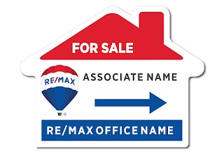
These RE/MAX signs, from page 36 of your Brand Identity Manual, are the lightweight signs. We have them all for you and our pricing includes the H-stake frame!


Top & Bottom Riders 

Plus Miracle Home Network Rider Coming Soon!

http://customsigncenter.com/remax-2018-rebranding/remax-real-estate-riders


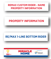
There are several variations of riders that comply with RE/MAX brand refresh. Top riders, in 1 and 2 lines in Primary Red. One-line Bottom Riders in primary blue. Bottom riders are not to be used on vertical signs. Another restriction is your rider's width must match the width of your sign. We've got you covered and all in one place.


Special Frame 30"h X 24"w

http://customsigncenter.com/remax-2018-rebranding/remax-frames

Specifically for your vertical standard signs, and RE/MAX Collection signage, this frame keeps you in compliance. There are no riders allowed on the bottom of your vertical signs. (Pg 35 of Brand Identity Manual.)

All this and So Much MORE!


Vinyl Banners (Varied Sizes)

http://customsigncenter.com/remax-2018-rebranding/remax-magnets-and-banners

Magnetic Vehicle Signs (Varied Sizes)

http://customsigncenter.com/remax-2018-rebranding/remax-magnets-and-banners


Custom Sign Center is here to help

Keep your signage compliant.

Protecting the RE/MAX brand and helping our Realtor Partners save time, money and ultimately the need to replace signage that is not in compliance with RE/MAX Standards.
 Replace all your RE/MAX signs today!

Tuesday, June 6, 2017

Help us celebrate 48 years building signs and helping businesses build their brands.

Wednesday, May 31, 2017


Will you be watching the game or attending?

Tuesday, May 9, 2017

Wahlburger's New Downtown Cleveland OH Location

Signs done by: Custom Sign Center & Boyer Signs & Digital Graphics


Custom Sign Center and Boyer Signs & Digital Graphics completed the Wahlburger project in Cleveland Ohio recently and there seems to be a lot of talk on social media about the opening.  We were told it was to be May 5th, but it appears to have been postponed till May 13. While we won’t speculate why it was postponed, the later opening has created a lot of buzz around the new location at 2105 Ontario Street just across the street from the J-A-C-K Cleveland Casino.

Wahlburger's Facebook page merely says ‘Coming Spring 2017 Stay tuned for more updates!’  On April 23 they held a job fair to fill 120 new positions the restaurant will create with its opening.  Their opening comes just in time for the Cav’s set to play in the final of the Eastern Conference Championship.  There is no shortage of other events in downtown Cleveland. There is the Rock N Roll Hall of Fame, A Christmas Story House, Greater Cleveland Aquarium, Jack Cleveland Casino, Cleveland’s Museum of Natural History, Cleveland Museum of Art and First Energy Stadium. Wahlburger's is in the perfect place to catch a lot of that traffic for lunch and dinner.
We had a great time working with their team to finish the project and look forward to working with them on new locations around Ohio.

Wednesday, March 8, 2017

5 Tips for Great Real Estate Sign Designs


5 TIPS FOR

GREAT REAL ESTATE

SIGN DESIGNS

Here's the deal...
 
No matter if you’re a Real Estate Agent or a car salesman you are going to use signs, in one way or another, to market your business. You want your signs to be effective and not just affordable so you’ll want a really good design that attracts new customers. There are a lot of ways to design a real estate panel. If you want to go a step further than using our design templates at CustomSignCenter.com and plugging in your information following are some great tips on how to design your own sign and create an effective and impactful design to make your open house wildly successful.  We start out with the most obvious: 

      1)  Identify Your Target Audience

Brand identification is one of the most important aspects of your signage. Building your Brand to the point where people only need to see the color combination and your logo to know who you are is the ultimate goal.  The first task in any marketing strategy is to identify the people with whom you want to work. I know most of you out there are saying that you want to work with anyone selling or buying a home. I understand you’re hungry.  However, if you find your niche, you’ll be happier because you’ll be working with buyers and sellers you like and who like you. A lot of people don’t think that they should narrow down their client base. But if you’re working day and night you’ll want to work with people you like and list homes you have fun selling.  Designing your signs for those with whom you want to work is the rifle approach as opposed to the shotgun approach that tries to appeal to everyone. When you compete at everything often times it means you are winning at nothing.
Now that you have a target audience for your signs narrowed down you can start designing, right?

Not so fast...

  2) Choose a Color Palette


First you need to know what colors will be best to attract your Target Audience. You could do a little research on this or you could just choose a color palette that expresses your inner self, colors you like. While Color Theory ideas abound there are a few things you should remember.  
  1.  Colors have different meanings to different cultures
  2.  Warm colors (reds, oranges, yellows) are associated with power, and are vivid  or bold in nature
  3.  Cool colors (blues, purples, greens) are associated with nature, wealth, creativity and are calming or soothing in nature
That is great information but how can you actually use it to help choose your color palette? First let’s discuss the three types of color palettes so you can decide which is best for your purposes.
There are 3 traditional types of color palettes,
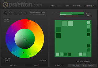
  1. Monochromatic – a color scheme made up of different tones, shades and tints within a specific hue. In the image below, from paletton.com you see a green monochromatic palette with light greens and dark greens as well as the original color chosen. The dot on the wheel shows you the original color chosen for this example.

  2.  Analogous – a color scheme made up of at least three different colors next to each other on the color wheel. In the example below you see 3 dots in the color wheel, these are our original selections and to the right are the options for the palette. 

  3. Complementary – a color scheme made up of at least two different colors on opposite sides of the color wheel.  In the example below you have purple and yellow. These are great together as they contrast well.
    Paletton.com 

    Contrast is one of the things that is important on your sign. Without contrast a person can not read the information presented and your sign fails. With high contrast you attract attention and your information is easily absorbed by the viewer.

    Another important aspect of your sign is the text.
     

      3) Typeface / Font Family

    Don’t forget that the selection of your typeface or font family is just as important as your colors.  Choose a font family that has a lot of varying weights that range from regular to bold, to black.  This will keep your use of different fonts down to one or two, which makes your sign more cohesive and consistent.  This also makes it easier for the view to absorb the information.  I know you’re going to choose a script style font as well.  Just make sure you choose one that is readable. All your text should be readable from a distance. For best visibility letters 3” tall can be seen well from 30 feet to almost 100 feet away.  Keep this in mind when adding your text.

    Now that you’ve had a chance to consider what colors and fonts are best you can start to design your sign, right?

    Not quite yet!

     4) Sign Elements

    Before diving in to create your sign you need to think about the purpose of your sign? Brand Awareness, Increased Online Traffic, Increased Open House Traffic, etc.  Once you have this pinned down you can easily decide what information needs to be displayed on the sign. For Realtors there are several things that you’ll need to include.

                1)    Your Logo or Logotype
                2)    Equal Housing Logo *
                3)    MLS / Realtor Logo
                4)    Phone Number
                5)    Website URL
                6)    Message

    Now that you have decided what to include on your sign and what fonts and colors to use it’s time to design your sign, right?

    Yessiree Bob, it's time...

      5) Designing Your Sign

    If you’re designing your sign yourself, and a lot of my Realtor friends do, it may be helpful to have assistance configuring the look of your sign. There is some great info out there but the most basic of ideas is the rule of thirds. This is one of those design rules I’ve carried around with me for two decades and it has served me well.  The rule of thirds is a three-frame wide by three-frame high grid that can be applied over any design. This grid will show you where a person’s eye will rest as they scan your design.  Below is a visual representation of that idea from https://designmodo.com:
    Rule of Thirds Visual: https://www.pinterest.com/explore/rule-of-thirds/ 


    You’ll want to put the most important information into the top left area of your sign where 41% of eyes will rest first. This is the ideal location for your logo or other key information. The Dots on the above visual are your power points. After resting their eyes at the bottom of the top left they will fall down to the top of the bottom box. A great place for your phone number and then up and to the right and last to the bottom right, which is the perfect place for disclaimers and equal housing logos.  Be creative, try a few different things. Print them out and look at them from a distance to see how your potential customer will see it. Once you’re satisfied you’re ready to send it to print.
    You can easily upload your sign design to a template on customsigncenter.com.  If you’re having trouble or want to see the process beforehand, check out this presentation.

    Happy Designing!